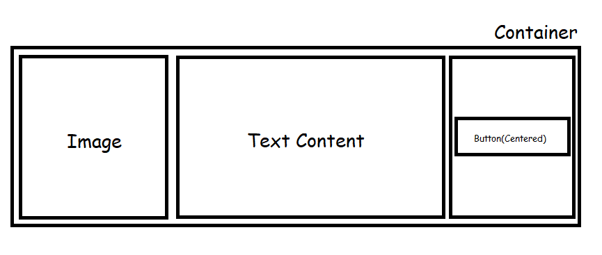
按钮本身的 margin-top 可能是答案,但对我来说感觉不对。如果有希望,答案将得到证实。将按钮降低一点的最佳解决方案是什么?
额外背景关系的代码笔:https ://codepen.io/AdanRod133/full/WNZEYJX
body {
  font-family: "Poppins", sans-serif;
  display: flex;
  justify-content: center;
  align-items: center;
  height: 100vh;
}

.container {
  background-color: coral;
  display: grid;
  grid-template-columns: 100px 300px 115px;
  grid-row-gap: 1em;
  justify-content: space-around;
  align-items: center;
  width: 50%;
  height: 100px;
  padding: 10px;
}

img {
  width: 100%;
  height: 100%;
  background-color: #2D8C9E;
}

.btn-learn {
  justify-self: center;
  align-self: center;
  height: 40px;
  border: none;
  border-radius: 10px;
  width: 125px;
}

.body-title {
  font-size: 1.15em;
  line-height: 1.5em;
  font-weight: bold;
  justify-self: center;
}

.text-body {
  font-size: 16px;
  grid-column: 3 / 5;
}<div class="container">
<img src="" alt="">
<div class="content">
<h3 class="body-title">
Startup
</h3>
<p class="text-body">Create Websites Online using the Startup Boostrap 5 builder</p>
</div>
<button class="btn btn-learn">Learn More <i class="fas fa-arrow-right"></i></button>
</div>uj5u.com热心网友回复:
我已经将你的按钮包裹在一个 flex 容器中并使用了它的属性 align-items: center
我还做了一些样式更改
你在网格中制作了三列 100px 300px 和 100px
但分配了宽度为 125px 的按钮,这会导致样式错误
<div class="container">
    <img src="" alt="">
    <div class="content">
        <h3 class="body-title">
        Startup
    </h3>
    <p class="text-body">Create Websites Online using the Startup Boostrap 5 builder</p>
    </div>
    <div class="button-container">
    <button class="btn btn-learn">Learn More <i class="fas fa-arrow-right"></i></button>
    </div>
</div>
body{
    font-family: "Poppins", sans-serif;
        display: flex;
        justify-content: center;
        align-items: center;
        height: 100vh;
}

.container{
    background-color: coral;
    display: grid;
    grid-template-columns: 100px 300px 125px;
    grid-row-gap: 1em;
    justify-content: space-between;
    align-items: center;
    width: 40%;
    height: 90px;
    padding: 5px 20px;
}

img{
    width: 100%;
    height: 100%;
    background-color: #2D8C9E;
}

.btn-learn{
/*  justify-self: center; */
/*  align-self: center; */
    height: 40px;
    border: none;
    border-radius: 10px;
    width: 100%;
/*  margin-top: 16px; */
}

.body-title{
    font-size: 1.15em;
    line-height: 1.5em;
    font-weight: bold;
    justify-self: center;
}

.text-body{
    font-size: 16px;
    grid-column: 3 / 5;
}

.button-container
{
    height: 100%;
    margin: 0;
    padding: 0;
    display: flex;
    align-items:center
}
uj5u.com热心网友回复:
你应该div以更好的方式重组你的。例如,我认为您正在寻找这样的内容框:
如果您不熟悉前端 Web 开发,我建议您使用 Bootstrap。
以下是 Bootstrap-5 代码外观的示例。
<!DOCTYPE html>
<html lang="en">
  <head>
    <!-- Required meta tags -->
    <meta charset="utf-8" />
    <meta name="viewport" content="width=device-width, initial-scale=1" />

    <!-- Bootstrap CSS -->
    <link
      href="https://cdn.jsdelivr.net/npm/bootstrap@5.0.2/dist/css/bootstrap.min.css"
      rel="stylesheet"
      integrity="sha384-EVSTQN3/azprG1Anm3QDgpJLIm9Nao0Yz1ztcQTwFspd3yD65VohhpuuCOmLASjC"
      crossorigin="anonymous"
    />

    <title>Hello, world!</title>
    <style>
      body {
        font-family: "Poppins", sans-serif;
        display: flex;
        justify-content: center;
        align-items: center;
        height: 100vh;
      }

      img {
        width: 100%;
        height: 100%;
        background-color: #2d8c9e;
      }

      .btn-learn {
        justify-self: center;
        align-self: center;
        height: 40px;
        border: none;
        border-radius: 10px;
        width: 125px;
      }

      .body-title {
        font-size: 1.15em;
        line-height: 1.5em;
        font-weight: bold;
        justify-self: center;
      }

      .text-body {
        font-size: 16px;
        grid-column: 3 / 5;
      }
    </style>
  </head>
  <body>
    <div class="container">
      <div class="row">
        <div class="col-2">
          <img src="" alt="" />
        </div>
        <div class="col-8">
          <h3 class="body-title">Startup</h3>
          <p class="text-body">Create Websites Online using the Startup Boostrap 5 builder</p>
        </div>
        <div class="col-2 d-flex flex-column justify-content-center">
          <button class="btn btn-learn">Learn More <i class="fas fa-arrow-right"></i></button>
        </div>
      </div>
    </div>
    <script
      src="https://cdn.jsdelivr.net/npm/bootstrap@5.0.2/dist/js/bootstrap.bundle.min.js"
      integrity="sha384-MrcW6ZMFYlzcLA8Nl NtUVF0sA7MsXsP1UyJoMp4YLEuNSfAP JcXn/tWtIaxVXM"
      crossorigin="anonymous"
    ></script>
  </body>
</html>
uj5u.com热心网友回复:
这是css档案。
    body {
        font-family: "Poppins", sans-serif;
        display: flex;
        justify-content: center;
        align-items: center;
        height: 100vh;
    }

    .container {
        background-color: coral;
        display: flex;
        flex-wrap:no-wrap;
        justify-content: space-between;
        align-items: center;
        width: 80%;
        height: 100px;
        padding: 10px;
     }

    img {
        width: 100px;
        height: 100px;
        background-color: #2D8C9E;
    }

    .content {
        padding:0% 2%;
    }

    .body-title {
        font-size: 1.15em;
        line-height: 1.5em;
        font-weight: bold;
        justify-self: center;
     }

    .text-body {
        font-size: 16px;
        grid-column: 3 / 5;
    }

    .btn-learn {
        height: 40px;
        border: none;
        border-radius: 10px;
        width: 125px;
    }
和这样的 html 档案
<div class="container">
    <img src="" alt="">
      <div class="content">
        <h3 class="body-title">
          Startup
        </h3>
        <p class="text-body">
            Create Websites Online using the Startup Boostrap 5 builder
        </p>
      </div>
      <button class="btn btn-learn">
          Learn More
             <i class="fas fa-arrow-right"></i>
      </button>
    </div>


0 评论