我正在开发 iOS 和 Android 上的跨平台应用程序。
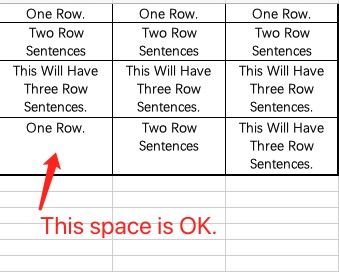
现在我想在一个大网格中显示一些搜索结果,每个单元格都可以点击。每行应该有 3 个结果,并且同一行中的每个单元格都应该具有相同的高度和阴影框。每个结果可能有不同的高度。
这是一张展示我想要的图片(就像 Excel 一样):
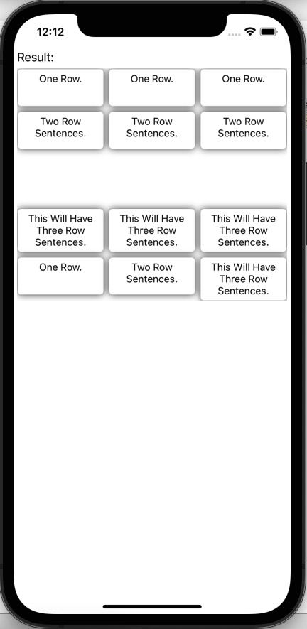
首先,我尝试使用具有索引项目串列的 BindableLayout Grid。每个项目都有一个 Row 和一个 Col 属性来填充到一个单元格中。但 Grid 的高度不同。这是xaml。
<ContentPage.BindingContext>
    <mvvm:GridViewModel />
</ContentPage.BindingContext>
<ContentPage.Content>
    <StackLayout Margin="5,50,5,0" >
        <Label Text="Result:" />
        <ScrollView x:Name="scrollViewResult" VerticalOptions="StartAndExpand">
            <Grid BindableLayout.ItemsSource="{Binding GridResult}" ColumnDefinitions="*,*,*" RowDefinitions="Auto" VerticalOptions="StartAndExpand">
                <BindableLayout.ItemTemplate>
                    <DataTemplate>
                        <!-- Every cell is a nested Grid. Using grid is for the purpose of button.-->
                        <Grid x:Name="NestedGrid" Grid.Row="{Binding Row}" Grid.Column="{Binding Col}" RowDefinitions="Auto" ColumnDefinitions="*" >
                            <!-- Frame for the corner radius and shadow.-->
                            <Frame Grid.Row="0" Grid.Column="0" CornerRadius="5" Margin="1">
                                <!-- Label text is real display text.-->
                                <Label Text="{Binding Value}" Margin="-15" FontSize="Small" LineBreakMode="WordWrap" HorizontalOptions="Center" VerticalOptions="StartAndExpand" HorizontalTextAlignment="Center"/>
                            </Frame>
                            <!-- Here placing a hole-cell button for a better click gesture. -->
                            <Button Grid.Row="0" Grid.Column="0" BackgroundColor="Transparent" Clicked="Button_Clicked" Margin="5"/>
                        </Grid>
                    </DataTemplate>
                </BindableLayout.ItemTemplate>
            </Grid>
        </ScrollView>
    </StackLayout>
</ContentPage.Content>
喜欢下面。emmmmm,不好(BindableLayout Grid):
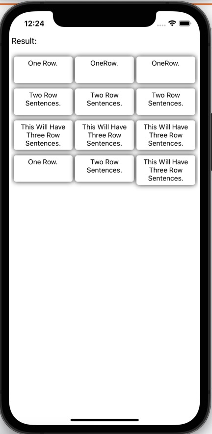
Then, I tried to use nested BindableLayout Grid(only one row) in a BindableLayout StackLayout. Every item in StackLayout is a list, every item in the list has a Col property to fill into a cell. Act a little better but not enough, for some short text will still hold large blank, and some has different height in a row.
<ContentPage.BindingContext>
    <mvvm:GridInGridViewModel />
</ContentPage.BindingContext>
<ContentPage.Content>
    <StackLayout Margin="5,50,5,0" >
        <Label Text="Result:" />
        <ScrollView x:Name="scrollViewResult" VerticalOptions="FillAndExpand">
            <StackLayout BindableLayout.ItemsSource="{Binding GridResult}">
                <BindableLayout.ItemTemplate>
                    <DataTemplate>
                        <!-- Every Grid has one row and 3 columns.-->
                        <Grid x:Name="ARowGrid" Margin="5,5,5,0" ColumnSpacing="5" RowSpacing="15" RowDefinitions="Auto" ColumnDefinitions="30*,30*,30*" BindableLayout.ItemsSource="{Binding Items}">
                            <BindableLayout.ItemTemplate>
                                <DataTemplate>
                                    <!-- Every cell in ARowGrid is a nested Grid. Using grid is for the purpose of button.-->
                                    <Grid x:Name="NestedGrid" Grid.Row="0" Grid.Column="{Binding Col}" RowDefinitions="Auto" ColumnDefinitions="*" >
                                        <!-- Frame for the corner radius and shadow.-->
                                        <Frame Grid.Row="0" Grid.Column="0" CornerRadius="5" Margin="0">
                                            <!-- Label text is real display text.-->
                                            <Label Text="{Binding Value}" Margin="-15" FontSize="Small" LineBreakMode="WordWrap" HorizontalOptions="Center" VerticalOptions="Start" HorizontalTextAlignment="Center"/>
                                        </Frame>
                                        <!-- Here placing a hole-cell button for a better click gesture. -->
                                        <Button Grid.Row="0" Grid.Column="0" BackgroundColor="Transparent" Clicked="Button_Clicked" Margin="5"/>
                                    </Grid>
                                </DataTemplate>
                            </BindableLayout.ItemTemplate>
                        </Grid>
                    </DataTemplate>
                </BindableLayout.ItemTemplate>
            </StackLayout>
        </ScrollView>
    </StackLayout>
</ContentPage.Content>
It acts like this (a BindableLayout Grid in BindableLayout StackLayout):
So is there any way to adjust height of ever row of a grid to fit the content's height, with every cell in a row has the same height, the height is the max height of content(may be add some margin).
Added 1.======================
I tried the collection view. It not works well too. The Xamarin as follows.
<ContentPage.BindingContext>
    <mvvm:GridViewModel />
</ContentPage.BindingContext>
<ContentPage.Content>
    <StackLayout Margin="5,50,5,0" >
        <Label Text="Result:" />
        <ScrollView x:Name="scrollViewResult" VerticalOptions="StartAndExpand">
            <CollectionView ItemsSource="{Binding GridResult}" VerticalOptions="StartAndExpand">
                <CollectionView.ItemsLayout>
                    <GridItemsLayout Orientation="Vertical"
                                     Span="3"
                                     VerticalItemSpacing="5"
                                     HorizontalItemSpacing="5" />
                </CollectionView.ItemsLayout>
                <CollectionView.ItemTemplate>
                    <DataTemplate>
                        <!-- Every cell is a nested Grid. Using grid is for the purpose of button.-->
                        <Grid x:Name="NestedGrid" RowDefinitions="Auto" ColumnDefinitions="*" VerticalOptions="Start">
                            <!-- Frame for the corner radius and shadow.-->
                            <Frame Grid.Row="0" Grid.Column="0" CornerRadius="5" Margin="1">
                                <!-- Label text is real display text.-->
                                <Label Text="{Binding Value}" Margin="-15" FontSize="Small" LineBreakMode="WordWrap" HorizontalOptions="Center" VerticalOptions="StartAndExpand" HorizontalTextAlignment="Center"/>
                            </Frame>
                            <!-- Here placing a hole-cell button for a better click gesture. -->
                            <Button Grid.Row="0" Grid.Column="0" BackgroundColor="Transparent" Clicked="Button_Clicked" Margin="5"/>
                        </Grid>
                    </DataTemplate>
                </CollectionView.ItemTemplate>
            </CollectionView>
        </ScrollView>
    </StackLayout>
</ContentPage.Content>
Here is the result. Emm, not well. CollectionView result
uj5u.com热心网友回复:
正如我上面提到的,在隐藏框架中添加隐藏标签可以解决这个问题。此外,我将 Button 的 HeightRequest 设定为一个小值(仅 1 行)并将 Margin 设定为固定值(仅 5)。
这是代码。
<?xml version="1.0" encoding="utf-8" ?>
<ContentPage xmlns="http://xamarin.com/schemas/2014/forms"
             xmlns:x="http://schemas.microsoft.com/winfx/2009/xaml"
             xmlns:mvvm="clr-namespace:RecForYou.Mvvm"
             x:Class="RecForYou.GridInGridPage">
    <ContentPage.BindingContext>
        <mvvm:GridInGridViewModel />
    </ContentPage.BindingContext>
    <ContentPage.Content>
        <StackLayout Margin="5,50,5,0" >
            <Label Text="Result:" />
            <ScrollView x:Name="scrollViewResult" VerticalOptions="FillAndExpand">
                <StackLayout BindableLayout.ItemsSource="{Binding GridResult}">
                    <BindableLayout.ItemTemplate>
                        <DataTemplate>
                            <!-- Every Grid has one row and 3 columns.-->
                            <Grid x:Name="ARowGrid" Margin="5,5,5,0" ColumnSpacing="5" RowSpacing="15" RowDefinitions="Auto" ColumnDefinitions="30*,30*,30*" BindableLayout.ItemsSource="{Binding Items}">
                                <BindableLayout.ItemTemplate>
                                    <DataTemplate>
                                        <!-- Every cell in ARowGrid is a nested Grid. Using grid is for the purpose of button.-->
                                        <Grid x:Name="NestedGrid" Grid.Row="0" Grid.Column="{Binding Col}" RowDefinitions="Auto" ColumnDefinitions="*" >
                                            <!-- Frame for the corner radius and shadow.-->
                                            <Frame Grid.Row="0" Grid.Column="0" CornerRadius="5" Margin="0">
                                                <!-- Label text is real display text.-->
                                                <Label Text="{Binding Value}" Margin="-15" FontSize="Small" LineBreakMode="WordWrap" HorizontalOptions="Center" VerticalOptions="Start" HorizontalTextAlignment="Center"/>
                                            </Frame>
                                            <Frame Grid.Row="0" Grid.Column="0" CornerRadius="5" Margin="0" BackgroundColor="Transparent">
                                                <!-- Label text is real display text.-->
                                                <Label Text="{Binding HiddenValue}" Margin="-15" FontSize="Small" LineBreakMode="WordWrap" HorizontalOptions="Center" VerticalOptions="Start" HorizontalTextAlignment="Center" TextColor="Transparent"/>
                                            </Frame>
                                            <!-- Here placing a hole-cell button for a better click gesture. -->
                                            <Button Grid.Row="0" Grid.Column="0" BackgroundColor="Transparent" Clicked="Button_Clicked" Margin="5" HeightRequest="10"/>
                                        </Grid>
                                    </DataTemplate>
                                </BindableLayout.ItemTemplate>
                            </Grid>
                        </DataTemplate>
                    </BindableLayout.ItemTemplate>
                </StackLayout>
            </ScrollView>
        </StackLayout>
    </ContentPage.Content>
</ContentPage>
而hole项目在github 上,结果如下。 结果
我不知道另一个框架和另一个标签是否存在任何性能问题。有没有更好的解决方案?
uj5u.com热心网友回复:
我在我这边做了一个测验,我发现内部网格的 RowDefinitions 是自动的,如果你将它设定为“*”,单元格将具有相同的高度。正如微软档案所说的关于网格长度:
GridLength 结构根据 GridUnitType 列举指定行高或列宽,该列举具有三个成员:
自动 – 根据单元格内容自动调整行高或列宽(XAML 中的自动)。
星号 – 剩余的行高或列宽按比例分配(XAML 中后跟 * 的数字)。
绝对 – 行高或列宽是与设备无关的单位(XAML 中的数字)中的值。


0 评论