我正在尝试使用 seaborn 中的拆分小提琴图绘制具有不同范围的两个变量。
这是我到目前为止所做的:
from matplotlib import pyplot as plt
import seaborn as sns
import numpy as np

df1 = pd.read_csv('dummy_metric1.csv')
df2 = pd.read_csv('dummy_metric2.csv')

fig, ax2 = plt.subplots()

sns.set_style('white')
palette1 = 'Set2'
palette2 = 'Set1'
colors_list = ['#78C850', '#F08030',  '#6890F0',  '#A8B820',  '#F8D030', '#E0C068', '#C03028', '#F85888', '#98D8D8']

ax1 = sns.violinplot(y=df1.Value,x=df1.modality,hue=df1.metric, palette=palette1, inner="stick")
xlim = ax1.get_xlim()
ylim = ax1.get_ylim()
for violin in ax1.collections:
    bbox = violin.get_paths()[0].get_extents()
    x0, y0, width, height = bbox.bounds
    violin.set_clip_path(plt.Rectangle((x0, y0), width / 2, height, transform=ax1.transData))
ax1.set_xlim(xlim)
ax1.set_ylim(ylim)
ax1.set_title("dummy")
ax1.set_ylabel("metric1")
ax1.set_xlabel("Modality")
ax1.set_xticklabels(ax1.get_xticklabels(), rotation=45, ha='right')
ax1.legend_.remove()

ax2 = ax1.twinx()

ax2 = sns.violinplot(y=df2.Value,x=df2.modality,hue=df2.metric, palette=palette2, inner=None)
xlim = ax2.get_xlim()
ylim = ax2.get_ylim()
for violin in ax2.collections:
    bbox = violin.get_paths()[0].get_extents()
    x0, y0, width, height = bbox.bounds
    violin.set_clip_path(plt.Rectangle((x0, y0), width / 2, height, transform=ax2.transData))
ax2.set_xlim(xlim)
ax2.set_ylim(ylim)
ax2.set_ylabel("Metric2")
ax2.set_xticklabels(ax2.get_xticklabels(), rotation=45, ha='right')
ax2.legend_.remove()

fig.tight_layout()
plt.show()
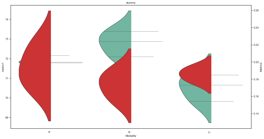
但是,我无法使用 ax2 小提琴的正确部分。这是输出。
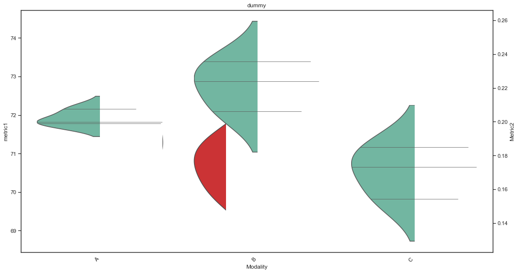
当我这样做时,violin.set_clip_path(plt.Rectangle((width/2, y0), width / 2, height, transform=ax2.transData))我得到了这个结果:
有人可以解释我错过了什么吗?另外,我该如何管理inner="stick"?
TIA
uj5u.com热心网友回复:
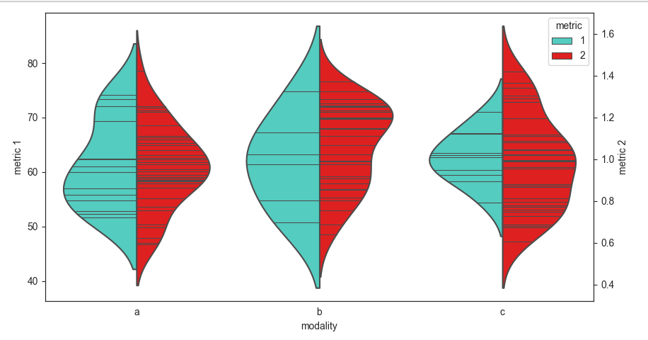
这是一种使用split=True虚拟资料强制拆分空一半的方法。对于左半部分,对于真实资料metric设定1为 ,2对于虚拟资料设定为 。反之亦然。我们需要确保所有资料框对modality列使用相同的分类顺序,以避免混淆。
from matplotlib import pyplot as plt
import seaborn as sns
import pandas as pd
import numpy as np

sns.set_style('white')
df1 = pd.DataFrame({'modality': pd.Categorical.from_codes(np.random.randint(0, 3, 30), ['a', 'b', 'c']),
                    'Value': np.random.rand(30) * 25   50})
df1['metric'] = 1
df1_dummy = pd.DataFrame({'modality': pd.Categorical.from_codes([0], ['a', 'b', 'c']), 'Value': [np.nan]})
df1_dummy['metric'] = 2

df2 = pd.DataFrame({'modality': pd.Categorical.from_codes(np.random.randint(0, 3, 100), ['a', 'b', 'c']),
                    'Value': np.random.randn(100).cumsum() / 10   1})
df2['metric'] = 2
df2_dummy = pd.DataFrame({'modality': pd.Categorical.from_codes([0], ['a', 'b', 'c']), 'Value': [np.nan]})
df2_dummy['metric'] = 1

ax1 = sns.violinplot(y='Value', x='modality', hue='metric', palette=['turquoise', 'red'],
                     inner="stick", split=True, data=pd.concat([df1, df1_dummy]))
ax1.legend_.remove()
ax1.set_ylabel('metric 1')

ax2 = ax1.twinx()
sns.violinplot(y='Value', x='modality', hue='metric', palette=['turquoise', 'red'],
               inner="stick", split=True, data=pd.concat([df2, df2_dummy]), ax=ax2)
ax2.set_ylabel('metric 2')

plt.tight_layout()
plt.show()
PS:这是原始代码的可能改编:
- 使用
plt.Rectangle((x0 width/2, y0), width/2, height)夹上AX2小提琴 - 使用
ax=自变量 ofsns.violinplot()指示正确的子图 - 不改变斧头的 xlim 和 ylim
- 确保两个资料帧使用相同的分类顺序
modality - 剪辑“内部”行, for
ax1:回圈遍历这些行,获取它们的x0andx1,并将该行缩短为x0and(x0 x1)/2 - 类似于 for
ax2:遍历各行,获取它们的x0andx1,并将该行缩短为(x0 x1)/2andx1 - 更新图例以
ax2将其与 的图例相结合ax1,然后洗掉ax1的图例
from matplotlib import pyplot as plt
import seaborn as sns
import pandas as pd
import numpy as np

df1 = pd.DataFrame({'modality': pd.Categorical.from_codes(np.random.randint(0, 3, 30), ['a', 'b', 'c']),
                    'Value': np.random.rand(30) * 25   50})
df1['metric'] = 1
df2 = pd.DataFrame({'modality': pd.Categorical.from_codes(np.random.randint(0, 3, 100), ['a', 'b', 'c']),
                    'Value': np.random.randn(100).cumsum() / 10   1})
df2['metric'] = 2

fig, ax1 = plt.subplots()

sns.set_style('white')
palette1 = 'Set2'
palette2 = 'Set1'

sns.violinplot(y=df1.Value, x=df1.modality, hue=df1.metric, palette=palette1, inner="stick", ax=ax1)
for violin in ax1.collections:
    bbox = violin.get_paths()[0].get_extents()
    x0, y0, width, height = bbox.bounds
    violin.set_clip_path(plt.Rectangle((x0, y0), width / 2, height, transform=ax1.transData))
for line in ax1.lines:
    x = line.get_xdata()
    line.set_xdata([x[0], np.mean(x)])

ax1.set_ylabel("metric1")
ax1.set_xlabel("Modality")

ax2 = ax1.twinx()
sns.violinplot(y=df2.Value, x=df2.modality, hue=df2.metric, palette=palette2, inner="stick", ax=ax2)
ylim = ax2.get_ylim()
for violin in ax2.collections:
    bbox = violin.get_paths()[0].get_extents()
    x0, y0, width, height = bbox.bounds
    violin.set_clip_path(plt.Rectangle((x0   width / 2, y0), width / 2, height, transform=ax2.transData))
for line in ax2.lines:
    x = line.get_xdata()
    line.set_xdata([np.mean(x), x[1]])
ax2.set_ylabel("Metric2")
ax2.set_xticklabels(ax2.get_xticklabels(), rotation=45, ha='right')
ax2.legend(handles=ax1.legend_.legendHandles   ax2.legend_.legendHandles, title='Metric')
ax1.legend_.remove()

fig.tight_layout()
plt.show()


0 评论